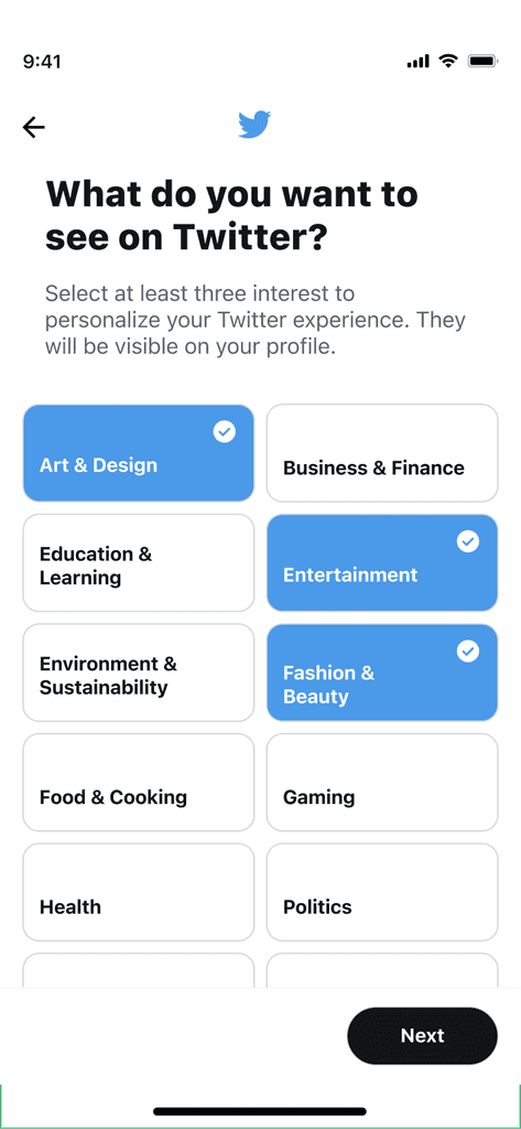
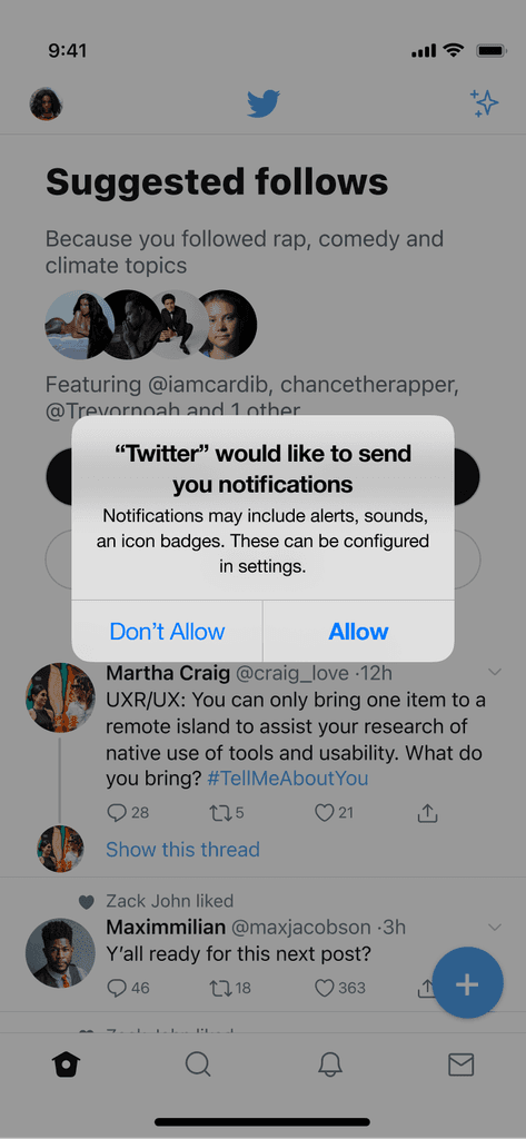
twitter notifications optimization
Leveraging notifications inbox as a guide for new users
Notifications onboarding helps new users feel more confident about using Twitter
An in depth retention analysis found that Twitter users who were eligible for and received notifications within their first week were 30% more engaged and retained 2x as well. However, 60% of Twitter users didn't get any notifications within their first week on the platform; new users also reported feeling confused by Twitter interactions and icons given their differences from other social media platforms. This led to decreased engagement in the weeks after which then affected retention.
I designed an optimized notifications experience for new users that leverages their visit to the in-app notifications tab as an opportunity to educate them and bolster their confidence to begin engaging with Twitter content and more quickly garner relevant notifications.
constraints
User Attention Span:
Users on Twitter typically have a short attention span due to the platform’s fast-paced nature. The solution needs to convey information quickly and concisely without overwhelming the user.
Limited Space in UI:
Constraint: The Twitter inbox has a limited amount of space for displaying educational or promotional content. The design must fit within existing UI constraints without cluttering the screen or detracting from the main function of the inbox.
Research & discovery
Competitors
Social media platform for sharing photos, videos, and stories, with a strong focus on visual content and personal branding.
Strengths
Visual onboarding: Instagram’s notifications help users get familiar with visual storytelling, encouraging early engagement with posts and stories.
Personalized content: Follow suggestions and content recommendations are tailored to user networks, making the experience feel relevant from the start.
More intuitive platform patterns, reducing the need for explanations
Weaknesses
Engagement pressure: New users are often quickly pushed to create content, which might be intimidating for users still exploring the platform.
Less personalized: There’s little focus on mental health guidance or peer support beyond just meeting in groups.
Social media platform for connecting with friends, sharing updates, photos, and participating in groups and events.
Strengths
Welcome notifications: Facebook welcomes new users and encourages them to update their profile with photos, bio details, and interests.
Friend suggestions: New users receive notifications suggesting friends to connect with, based on contacts, mutual friends, and interests.
Personal connections: Facebook focuses on helping new users quickly connect with friends and family, building familiarity making it less intimidating
Weaknesses
Complex ecosystem: Facebook’s broad range of features (events, groups, pages, marketplace, etc.) can feel overwhelming for new users who may not know where to start.
Professional networking platform focused on career development, job searching, and industry connections.
Strengths
Onboarding guidance: LinkedIn sends notifications to help users complete their profiles, such as adding work experience, skills, and education.
Weaknesses
Pacing: LinkedIn’s notifications for new users may seem slow compared to platforms like Instagram or Twitter, where engagement is faster and more frequent.
Limited social engagement: Notifications are often professional in tone, which might make the platform feel more formal or less socially engaging for new users.
User Research
To gain insights, I conducted interviews with new Twitter users and analyzed data on new user behavior, focusing on users who dropped off during the first week. Key findings included:
Lack of immediate interaction: Users often struggled with understanding how to engage on Twitter and find where in-depth conversations were happening
Unfamiliarity with Twitter features: New users frequently weren't aware of niche features like Spaces and Communities.
Desire for guidance: Users expressed a need for more direction in the early stages to learn how to use the platform effectively.
There were 2 recurring themes from the user search:
Feeling of Inactivity on the Platform
Found the platform 'empty' with no notifications.
No initial notifications, which made the platform feel inactive.
Desire for More Guidance
Expected continued guidance post-onboarding
Likes the concept of getting started tips through notifications.
Personas
Guy Mccoy
40 years old
Software engineer
Mid-size tech company
Needs & Goals
Learn how to navigate work politics
Figure out how to reduce stress from deadlines
Find a safe space to discuss challenges without judgment.
"Twitter is so confusing, especially when you're new. There's so much content, and it's hard to figure out where the deeper conversations are happening or the best ways to plug in."
Janet Johnson
25 years old
Freelance social media manager
Needs & Goals
Values efficiency
Needs actionable suggestions for using Twitter to optimize engagement for clients
Just getting started and wants to become a pro ASAP
"I'm feeling a bit overwhelmed and unsure about where to begin. I could really use some guidance on how to effectively engage with others and find the most effective features for my clients to improve engagement."
User Flow & Task Flow
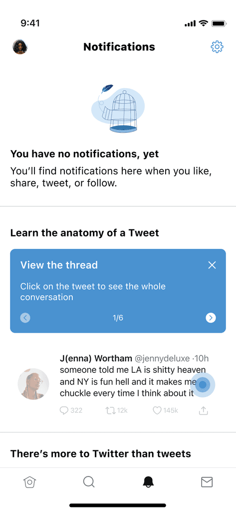
The Twitter inbox user flow starts with users accessing their notifications inbox. If the inbox is empty, users are guided through educational tips on how to use Twitter as well as suggestions to check out Spaces and Communities.
The main task flow requires users to view all the tips for using Twitter and successfully interact with their most recently viewed tweet, if applicable. Else, they are given a sample tweet to interact with.
ideation & wireframing
Ideation
I brainstormed multiple approaches for how to enhance the empty notifications inbox:
A simple vertical outline of Twitter icons and what they mean
Display tips auto-scrolling horizontally, using opacity to highlight relevant features from an example tweet
Leverage a real tweet the user previously saw to interactively walk through how to engage
I narrowed down top option #3 because it best facilitated the goal of driving engagement in real time as well as in the future. I also included elements of option 2 in order to make the UX as intuitive as possible.
Prototyping
I developed interactive prototypes to test different approaches to filling the empty inbox space. We conducted usability tests, focusing on:
Clarity of the demo tweet: Testing whether users understood the actions they could take (like, retweet, reply) and how it relates to their future experience on Twitter.
Engagement with Spaces and Communities prompts: Measuring how receptive people were to the recommendation of the niche features
Ease of navigation: Ensuring users could quickly move from the demo content to actual engagement on the platform.
After testing, we found that users were highly responsive to the sample tweet feature, particularly when combined with suggestions for Spaces and Communities. They appreciated the interactive guide and felt more confident in exploring the platform after completing the walkthrough.
testing & iteration
I created low fidelity wireframes to validate both the user experience as well as understand receptiveness to the overall concept. The feedback helped evolve designs from the first iteration to a more intuitive, clear user experience.
Before
After
Tooltip Structure
Before: No structure to the guided tutorial; low space and limited structure
V0
#
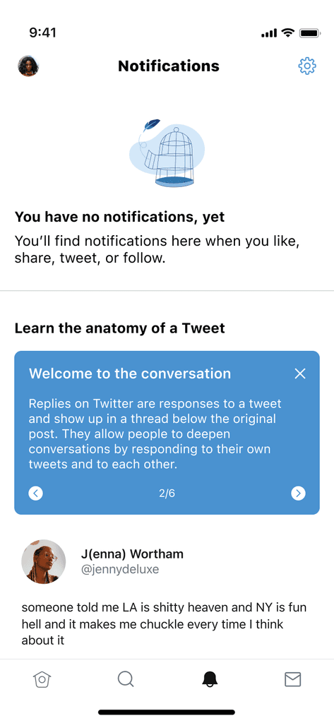
After: Structured tooltip enables easy skimming and digestibility
V1
Tip Navigation
Before: Auto-scroll navigation risks information being displayed too slowly or quickly for users
V0
#
After: Navigation UI allows users to navigate content at their pace
V1
Highlight UI
Before: Had a fixed relationship between the tooltips and the mechanism used to highlight, creating a static and less visually aesthetic experience.
V0
#
After: Separated the tooltip from the highlighting, Leveraged a lighter hue to make the call out more on-brand and clearly appear to be interactable.
V1
Progress Indicator
Before: Shape-based indicator gave a high level sense of completion which was not very motivational and clear
V0
#
After: Numerical navigation allows for exactness, providing greater achievement of how much the user has learned
V1
Aiding Twitter Feature Discovery
Before: List-format to list additional features or things users can do to discover more content on Twitter
#
After: Show, don't tell. Provide direct entry points to the most engaging features for new users upfront
V0
V1
The final design consisted of several key elements:
Last Seen Tweet as Demo
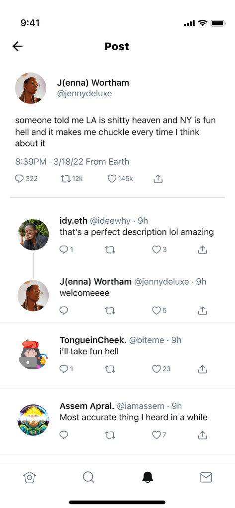
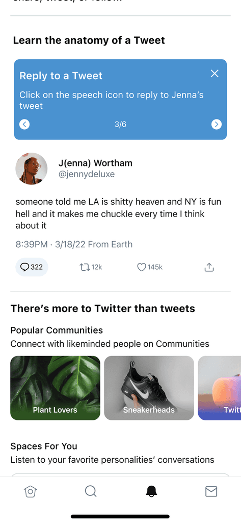
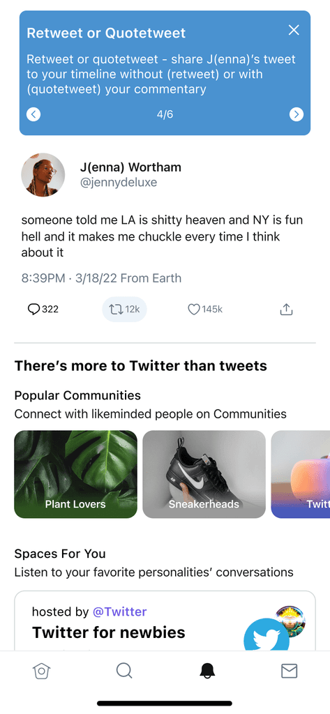
Display the user's last viewed tweet in the notifications inbox, demonstrating the core actions of replying, liking, and retweeting and as a hands-on guide, allowing users to interact with it as if it were a real tweet.
Interactive Notification Tips
Added tooltips explaining how notifications work and how users can trigger them by following people, engaging with content, and participating in discussions.
Feature Highlights for Spaces and Communities
Introduced users to Twitter Spaces and Communities via carousels with direct links to browse ongoing audio conversations or join communities that align with their interests.
The new onboarding notifications experience launched as part of a broader effort to improve user retention. Early metrics showed a 10% increase in new user engagement during the first week.
Higher First-Week Retention
New users who completed the interactive walkthrough showed a significantly higher likelihood of returning to the platform after the first week.
Increased Feature Adoption
There was a 12% increase in new users exploring Spaces and Communities after receiving prompts in their notifications inbox.
Improved Understanding of Twitter
Feedback from user surveys indicated that users felt more confident navigating Twitter’s features, particularly when it came to interacting with content and participating in discussions.
This project was a good opportunity for me to understand what it's like to build a feature for a specific part of an app with a very specific goal in mind. Many companies focus on onboarding, growth and retention opportunities, so this will be a foundation for me to continue thinking of new user experiences and how they can be improved in the future through step-by-step guidance and interactivity.
